March 29, 2013
We recently had the exciting opportunity to help Monotype, a 125-year-old typographic legend, revitalize and redefine their global brand. Working closely with the Monotype marketing team—vice president of corporate marketing Lisa Landa and design director Dennis Dimos—and Jason Rubin from Libretto, we developed a new brand identity around the new logo and typeface Kootenay, created by Monotype type director Steve Matteson.
The first physical manifestation of the new visual vocabulary and messaging was an oversized brand launch brochure that featured a letterpress cover and 16 pages of impactful imagery and, of course, typography, that explained both Monotype's place in history and its exciting role in the present and future. Our goal was to provide the reader with a narrative that takes them from the venerable lead past into the vivid digital present. Built around the company's value proposition of providing typefaces, technology, and expertise to its diverse worldwide customer base, the brochure features their new corporate font Kootenay along with a cornucopia of type styles with their diverse applications.
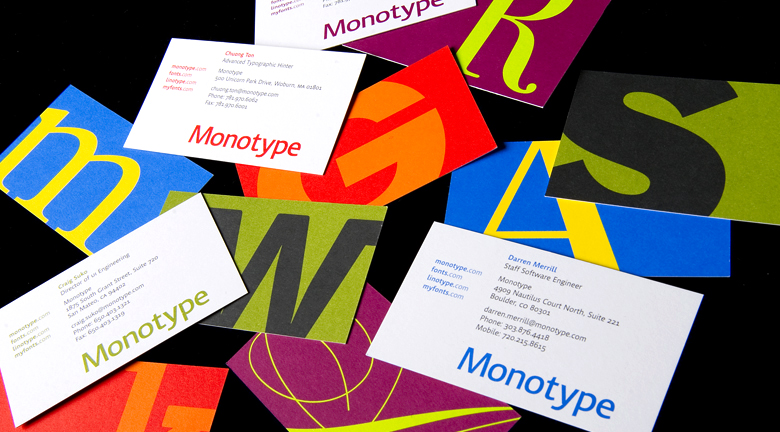
As part of the rebranding Stoltze also created a flexible stationery system that showcases Monotype's formidable roots in type design (and beyond) by incorporating large letterforms from their extensive font offerings. Click here to see more images!
